Gapminder World has long been one of my favorite resources for teaching about specific topics. I never fail to learn something from it.
Hans Rosling, creator of Gapminder
The dynamic charts you can produce with Gapminder are wonderful and wonderous.
There are hundreds of factors (environmental, health, energy, education… ) that you can choose to display on the Gapminder World graph and look for relationships between the factors.
Countries are displayed on the graph by circles whose size is dependent upon population and whose color is determined by location. You can choose to display all countries or just selected ones.
You can choose to see comparisons for nearly any year in the past two centuries (or more in some cases).
If you or your students have the hardware, set them to work evaluating hypotheses they make or describing changing relationships over time.
Many Gapminder demonstrations are available at YouTube as well.
A fact-based worldview starts with getting the big picture right. Each of these videos answer a common fact-question about global proportions and macro trends, in less than 90 seconds. We've left out any distracting details in order to make the big picture as clear as possible and easy to remember. Enjoy!
How Did The World Population Change?
How Did Babies per Woman Change in the World?
How Reliable is the World Population Forecast?
How Did Babies per Woman Change in Different Regions?
How Does Income Relate to Life Expectancy?
Will Saving Poor Children Lead to Overpopulation?
How Can the World Population Forecasts Be So Good?
How Many are Rich and How Many are Poor?
What Makes the World Population Continue to Grow?
Where Do People Live?
The Rapid Growth of the World Population, When Will it Slow Down?
Teaching Comparative blog entries are indexed. Use the search box to look for country names or concept labels attached to each entry.
The Comparative Government and Politics Review Checklist.
Two pages summarizing the course requirements to help you review and study for the final and for the big exam in May. It contains a description of comparative methods, a list of commonly used theories, a list of vital concepts, thumbnail descriptions of the AP6, and
a description of the AP exam format. $2.00. Order HERE.
Just The Facts! 2nd editionis a concise guide to concepts, terminology, and examples that will appear on May's exam.
If you have forgotten about Gapminder or not yet learned of it, now's a great time to poke around in the Gapminder universe. There is great material here for comparative politics students as well as for students of history.
The most wonderful thing about Gapminder is its flexibility. Teachers can use it to prepare materials for presentation. Students can use it to test hypotheses or teach each other about a huge variety of ideas.
There are dozens of statistical indicators that can be used to create comparisons between and among nations over the last 200 years. It's possible to select which countries to compare. (Want to limit the comparisons to the AP6 in Comparative Government and Politics?)
You can download or subscribe to the Factpods here.
Factpods are 1 to 7 minute podcasts by Hans Rosling. The most recent of them are about the fight against Ebola since Rosling has been working in Liberia since last September.
Teaching Comparative blog entries are indexed. Use the search box to look for country names or concept labels attached to each entry.
I searched this blog and found that I've mentioned Gapminder eleven times since 2006. Really, it's that good and valuable. Whether you use it to prepare presentations for students or ask them to use the Gapminder tools to create presentations to your class, it well worth whatever time and effort it takes.
You can use the Gapminder tools to display the relationships between variables and try to determine whether there are simply correlations of actual cause and effects.
You can choose from a large number of variables for each axis of the graph. And you can choose a specific year or a number of years. You are able to choose specific countries for the graph (UK, Russia, China, Nigeria, Mexico, and Iran, perhaps?). Each country is represented by a bubble in which size indicates the size of the population. The default setting for colors is each country's continent, but you can change that as well. If you choose a number of years, you can "play" the sequence in order to watch changes over time.
At the Gapminder site, you can access a great number of resources, including some specifically for teachers. There's a version of Gapminder (Gapminder World Offline) you can use on your computer, so you don't need to have Internet access for projects or demonstrations. There are videos, handouts, and lesson plans. There are Teacher's Guides to the Global Development Quiz and to Hans Rosling's presentation, "200 Years that Changed the World."
Stay tuned! Translations and more to come later this year.
Please help make the tools even better! The new tools are not fully polished yet, so check them out at gapminder.org/tools and give us feedback at info@gapminder.org.
All comments are most welcomed.
Teaching Comparative blog entries are indexed. Use the search box to look for country names or concept labels attached to each entry.
Amazon's customers gave this book a 5-star rating.
The Comparative Government and Politics Review Checklist.
Two pages summarizing the course requirements to help you review and study for the final and for the big exam in May. . It contains a description of comparative methods, a list of commonly used theories, a list of vital concepts, thumbnail descriptions of the AP6, and
a description of the AP exam format. $2.00. Order HERE.
The Gapminder World is an extensive collection of animated graphs illustrating how two sets of statistics interact and change over time. You can choose from 16 categories and see the relationships between 1976 and 2002. You can also choose what regions or countries you want to highlight and label.
There are ten presentations, called GapCasts, available on the Gapminder web site.
You can also find a video of an amazing presentation using Gapminder that is a superb demonstration of what's possible. The presentation by Hans Rosling at the 2006 TED conference, has been a hit on YouTube. Show it to your students before you send them to Gapminder to create their own presentations.
This presentation is described as "Hans Rosling debunks myths about the so-called "developing world" using extraordinary animation software developed by his Gapminder Foundation. The Trendalyzer software (recently acquired by Google) turns complex global trends into lively animations, making decades of data pop.
"Asian countries, as colorful bubbles, float across the grid, toward better national health and wealth. Animated bell curves representing national income distribution squish and flatten.
"In this video, a gifted speaker and fascinating animated data provide an inspiring view on common misconceptions about global trends (life expectancy, child mortality, poverty rates). In Rosling's hands, they become clear, intuitive and even playful." While I'm on the topic of presenting statistics, I want to mention WorldMapper
Worldmapper is a collection of world maps, where territories are re-sized on each map according to the subject of interest.
There are 366 maps, which are also available as PDF posters.
It's another way of presenting data that helps us all comprehend what the numbers mean. And one more. Visualizing Economics.
Visualizing Economics is a web site/blog by Catherine Mulbrandon and displays data about the US economy using easy-to-understand graphics. (Her interpretation of the statistics is fully informed by her undergraduate studies of economics at the University of Chicago.)
Okay, it is US economic statistics, but there are two reasons for comparativists to look at it.
First, there are bits of the US economy that are relevant to the study of other countries.
Second, the design of the presentation might give you or your students ideas about how to present other statistics.
We are inviting teachers from all around the world to help develop our new project "Gapminder School". If you are a teacher and you want to help, please let us know using the link above.
It took me four months to mention the earlier new tool from Google. Now, Gapminder has my attention. Here's the latest from the Gapminder/Google affiliation. This has the potential to be a valuable teaching tool or a way to improve student presentations.
Google Public Data Explorer, a new powerful visualization tool that lets you explore, visualize and share data in a “Gapminder-like” manner, was launched by Google [the week of March 8].
The new tool lets you explore data from a number of data providers such as World Bank, EuroStat, U.S. Bureau of Labor Statisitics and U.S. Census Bureau through “Bubble-charts”, maps, bar- or line charts, that you can share on your blog, web page or other media.
Three years ago, Google acquired Trendalyzer – the technology behind Gapminder World – from Gapminder. Since then, they have launched Motion Chart (a gadget that lets you make charts from you own data) and a public data search function that make it easier to find public data in a normal google search.
The new Public Data Explorer is still a Google Labs-project, which means that it is till work in progress. We hope that more data providers will make their data available through this technology to increase the use of data in the general discussion about the world.
You might be familiar with Rosling if you've seen Gapminder before. His presentations in 2006 and 2007 introducing the software are now classics on YouTube.
There are 17 presentations in English available on the Gapminder web site. Topics range from Swedish history, to global poverty, to human development, to population trends, to urbanization.
You can download statistics and presentations that you can use. You can upload data that you have to create presentations.
There are two new videos on the Gapminder website: an interview with Hans Rosling and Rosling's talk at the U.S. State Department this past summer.
There are nearly three dozen videos on the site. Many of them would be great to use if you want to introduce your students to what's possible with Gapminder.
Gapminder is a great teaching tool. And students can learn to create their own presentations.
Lisa Van Gemert, who teaches at Lamar High School in Arlinginton, Texas, recommended Hans Rosling's talk at the Technology, Entertainment, Design (TED) conference in 2006. She wrote, "Rosling is a professor of world health at a university in Sweden, and he has done amazing research and developed the software to deliver the data in an extraordinarily fascinating way."
I agree and if you haven't seen it, it's worth the time to sit down and watch it. It's online at the TED web site.
Rosling uses Gapminder software for his presentation, and that creates part of the impact of his presentation. His enthusiastic explanations are also key.
I wrote about Gapminder and other graphic presentation software last November in an entry titled, Seeing Statistics. Check it out if you missed it. And here's a reminder that you can see the categorized index of over 800 teaching comparative blog entries at the blog's del.icio.us site. You can view the index as an alphabetical list or as at Tag Cloud, which is another intriguing way to portray data.
An entry on the Gapminder blog, informed me about a new presentation of data available on Google. Well, it's new to me. Turns out the announcement was made last November. Editorial aside: For all the effort Google makes to look attractive when presenting itself and its search results, the blog reporting these added features is incredibly ugly and hard to read.
You or your students can embed comparisons in presentations in such a way that they will be updated whenever new data becomes available. What a great idea. Of course, if new data negates a point you're trying to make, maybe it's not such a great idea.
[Editorial comment: If you don't know about Gapminder yet, now's the time to find out.]
When we first launched public data on Google.com, we wanted to make statistics easier to find and to encourage debate based on facts rather than intuition. The day after we launched, a friend who worked at the World Bank called me, her voice filled with enthusiasm, "Did you know that the World Bank also just released an API for their data?" Excited, I checked it out, and found an amazing treasure trove of statistics for most economies in the world. After some hard work and analysis, today we're happy to announce that 17 World Development Indicators (list below*) are now conveniently available to you in Google search.
With today's update, you can quickly access more data with a broad range of queries. Search should be intuitive, so we've done the work to think through queries where public data will be most relevant to you. To see the new data, try queries like [gdp of indonesia], [life expectancy south africa], [rwanda's population growth], [energy use of iceland], [co2 emissions of iceland] and [gdp growth rate argentina]…
Clicking on [a] result will bring you to an interactive chart where you can compare the [country you're researching] with other regions around the world. We've also added a new feature to enable you to embed these charts in your own website or blog by clicking on the "Link" button in the upper right-hand corner of the chart page. You have the option to either embed the chart with static data, or you can also set the chart to update dynamically when new data becomes available...
[Here's the] complete list of World Bank indicators currently available: CO2 emissions per capita, Electricity consumption per capita, Energy use per capita, Exports as percentage of GDP, Fertility rate, GDP deflator change, GDP growth rate, GNI per capita in PPP dollars, Gross Domestic Product, Gross National Income in PPP dollars, Imports as percentage of GDP, Internet users as percentage of population, Life expectancy, Military expenditure as percentage of GDP, Mortality rate, under 5, Population, and Population growth rate.
Look for correlations in the Factbook, find historical trends and correlations with Gapminder, explore official and journalistic data from original sources. And, define democracy with V-Dem.
There is no consensus on the definition of democracy and how to measure it. The understanding of what a democracy really is varies across countries and regions. This motivates the V-Dem approach not to offer one standard definition of the concept but instead to distinguish among five principles different versions of democracy: Electoral, Liberal, Participatory, Deliberative, and Egalitarian democracy…
V-Dem differs from previous datasets by distinguishing among different principles of democracy (as discussed) and offering about 350 unique democracy indicators, 34 indices of various aspects of democracy such as freedom of association, and five main democracy indices for Electoral, Liberal, Participatory, Deliberative, and Egalitarian democracy. These all cover 173 countries, measured annually from 1900 to 2012…
Scholars, students, media, policy analysts, practitioners, and others interested in the status of democracy in the world can visit our website, where they can use the online analysis tools to generate graphs showing a country’s regime trajectory and comparisons with other country…
Teaching Comparative blog entries are indexed. Use the search box to look for country names or concept labels attached to each entry.
Amazon's customers gave this book a 5-star rating.
The Comparative Government and Politics Review Checklist.
Two pages summarizing the course requirements to help you review and study for the final and for the big exam in May. . It contains a description of comparative methods, a list of commonly used theories, a list of vital concepts, thumbnail descriptions of the AP6, and
a description of the AP exam format. $2.00. Order HERE.
Guy Kawasaki, entrepreneur and publicist, posted this link on his Google+ account.
It has great potential for teaching about political roles of women around the world. It's a Gapminder-like interactive graphic with a 20th century timeline and a world map displaying data for women's suffrage, the right of women to run for public office, and the election of women.
Chinese leaders like to talk about socialism with Chinese characteristics. It seems that growing economic inequality is one of those Chinese characteristics.
The large and growing gap between China’s rich and poor is one of the most obvious challenges facing the country’s new paramount leader, Xi Jinping, who will take over as president from Hu Jintao in March. In a signal the new leadership at least wants to start discussing the problem, the National Bureau of Statistics last week revealed the country’s Gini coefficient – which measures income inequality – for the first time in more than a decade.
As the official Xinhua newswire put it, the number “paints a far-from-rosy picture of what the country needs to do to bridge the wealth gap and make more people included in its magnificent growth story.”
The official figure of 0.474 is a belated acknowledgment that China has a serious problem. On the Gini scale, 0 is perfect equality and 1 is total inequality – any rating above 0.4 is considered to be dangerous to social stability. But the country’s chief statistician, Ma Jiantang, also made an eyebrow-raising assertion: that Chinese society has been getting more equal each year since 2008, when the Gini coefficient peaked at 0.491.
That seems at odds with the realities on the streets of a place like Chongqing, where it’s increasingly common to see luxury sports cars swerving through streets clogged by three-wheeled taxis. Indeed, a study conducted last year by the Chengdu-based Survey and Research Centre for China Household Finance concluded the Gini coefficient ACTUALLY stood at 0.61 in 2010, which would put China among the most unequal societies in the world…
During the summer teaching institute I taught at Carleton College in June, one of the things we discovered as we explored Gapminder (check it out if you don't know about it), was that road building in Nigeria has been non-existent during the past few years. Road repairs cannot have been very effective either, since the number of miles of paved roads has declined dramatically.
Your students should be able to read between the lines and describe some things the political situation in Abuja.
THE Federal Government, through its Works Minister, Alhaji Hassan Adamu Lawal, yesterday reacted to the deplorable state of federal roads in the country, in particular the Apapa-Oshodi expressway in Lagos [below], saying "we have to be careful."
FLOOD: Mile 2 along Apapa-Oshodi Express Way taken over by flood following a down pour in Lagos.
It was not clear who should be careful -- the government, Nigerians who suffer daily, or the media who report the suffering of Nigerians -- as the minister refused to talk to State House correspondents...
[W]hen he eventually emerged from the Council Chambers of the Presidential Villa, venue of the FEC meeting , the minister who was not apparently ready to field questions from journalists said "I have discussed with my boss, we have to be careful", a statement that did not make any meaning to reporters.
Asked to explain what he meant by "we have to be careful", the minister failed to utter a word, as he walked out on the reporters.
Vanguard's investigations however revealed that President Yar'Adua... had repeatedly drawn the attention of the minister to the issue, asking that he comes up with a workable solution towards addressing the issue as it has become a major source of negative publicity to the government.
It was gathered that the Hassan Lawal, who has served as minister for five years, including three years under former President Olusegun Obasanjo, as Labour minister, and two years in the present government, could not come up with any solution...
LAGOS, the nation's economic capital and financial hub has been paralysed by intractable traffic snarl-up, worsened by heavy downpour witnessed in the last few days.
The Oshodi-Apapa expressway is has, for many years, been neglected resulting in its present state of decay. The drainage systems have become dumping ground by companies doing business along the stretch, while Tokunbo vehicle sellers take over some of the available spaces left on the road.
Remedial works carried out on the road in the past have not helped matters as they have only been peripheral and did not really address the state of the road...
These are like animated Power Point slides that present comparisons between poverty rates in Nigeria and the US or between health indicators over the past 30 years. They seem to have great potential as teaching tools. Check them out and see what's useful. They present obvious comparisions that can be evaluated by students who can then be asked to speculate on the political implications of the numbers.
O'Neil also recommended a Technology Entertainment Design site where he says it's possible to see some of these animated presentations of statistics. However, when I tried the link from my rainy vacation link in northwest Wisconsin, I got an error message. Maybe it will work later.
Thank you, Patrick. These look great even if I can't get the demo site to work.
Teaching (and learning) comparative government and politics is a complex and demanding task. We can all use all the help we can get. This cyber place is somewhere to facilitate helpful interactions.


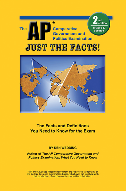 Just The Facts! 2nd edition is a concise guide to concepts, terminology, and examples that will appear on May's exam.


